Why business intelligence falls flat

When I joined a previous company as the head of product, I tried hard to make the company more data-driven. We paid for an expensive business intelligence platform and I worked with our data team to create a killer dashboard. I led a weekly meeting where we reviewed the dashboard with team leaders.
Everyone in these data review meetings looked depressed and checked out. At the time, I was judgmental about it. I thought, "wow, these folks don't care about data."
Now I understand what the real problem was. It wasn't that people didn't care about the story the data was telling. They did care, and they were worried that the numbers were flat. The problem was they had no idea what they could do about it. The metrics in the dashboard were divorced from the actual work happening on the ground. Viewing the charts made everyone feel helpless. While I thought I was making my company more data-driven, I was actually just torturing my colleagues.
My naivete about metrics was a big reason I failed to make my company more data-driven. However, I've since realized that the format of metric dashboards also had a role play.
As the media theorist Marshall McLuhan said, "The medium is the message." And the medium of today's business intelligence tools does not lead us to use data effectively in decision-making.
In this post, I’m going to illustrate how we’re only at the beginning of realizing the potential of what business intelligence can be. We're ready for a new medium.
Note: if you'd rather consume this as a video instead of a post, skip to the end.
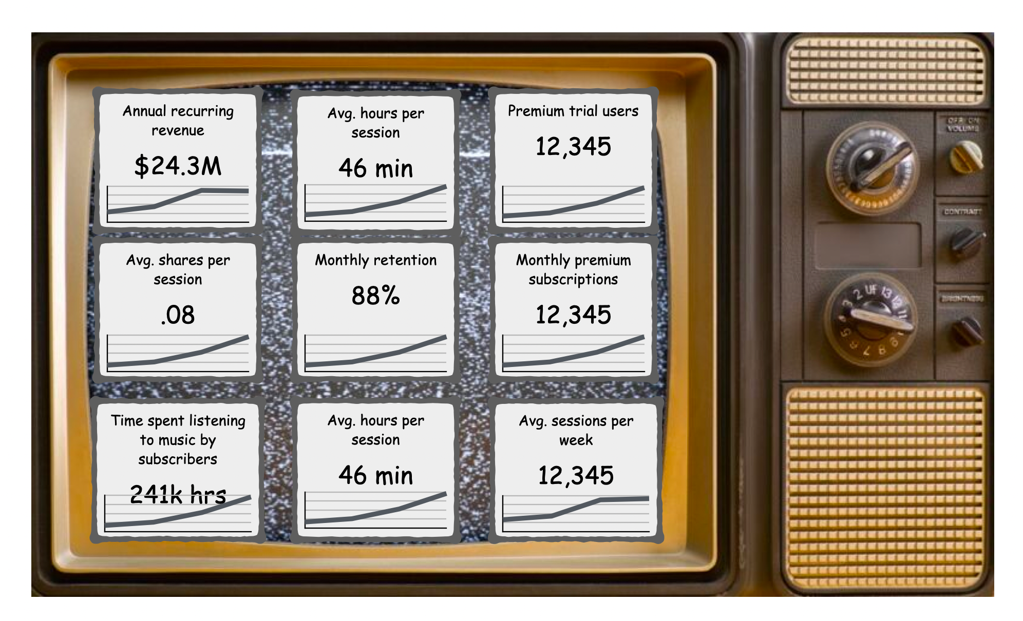
Imagine that we work at a music subscription service, like Spotify. We might have an executive dashboard that looks like this.
On the surface, it might seem like a company with access to these metrics has good visibility into its business. However, from a decision-making perspective, this dashboard is limited and ambiguous.
The problem is not that we don’t have the right data. The problem is that it’s not clear how we can influence the business outcomes.
For example, revenue is flat, but what can we do about it? It's like looking at the scoreboard when the game is already over.
On the other hand, there are metrics, like average hours per session, that we can directly influence with product improvements. But will optimizing this metric lead to the business impact that we’re looking for? It's unclear.
The underlying problem is that the executive dashboard is “flat”. Flat dashboards conflate leading and lagging indicators. Consequently, they are hard to put into action.
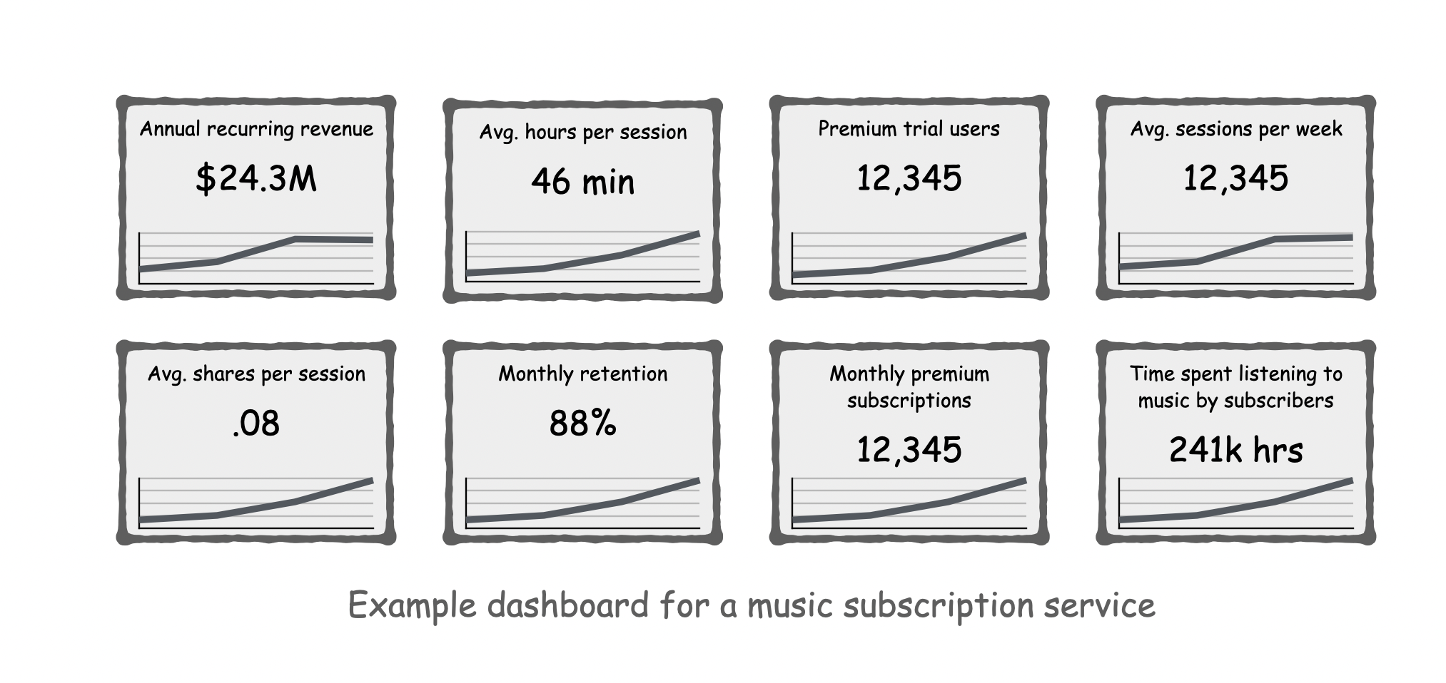
So let’s try adding another layer of organization.
This dashboard is starting to look better. Now we’re separating the leading indicators from the lagging business KPIs.
The lagging KPIs like revenue and retention are critical to the business, but they can't be directly influenced by work. That's why companies like Amazon identify "input metrics," lead measures (1) that can be influenced by work and (2) are predictive of lagging business KPIs.
But there’s still more we can do to make this metrics dashboard useful…
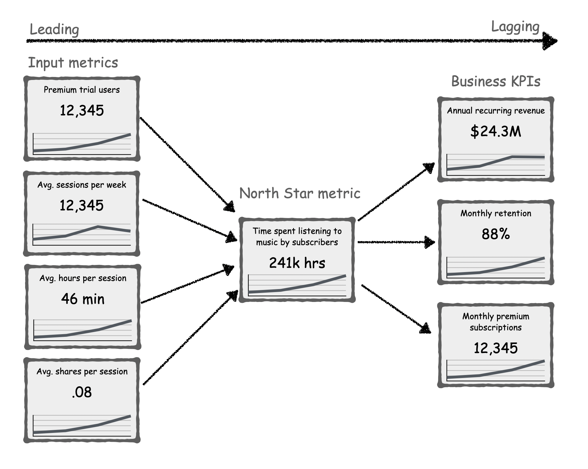
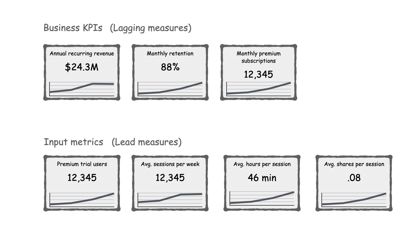
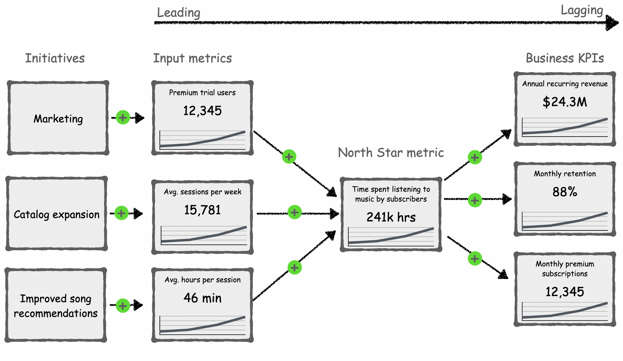
When we organize the dashboard in the form of a graph, the relationship between metrics becomes explicit. The metrics are laid out on a spectrum from leading to lagging so it’s clear what we can influence in the short-term versus long-term.
And we can still do better…
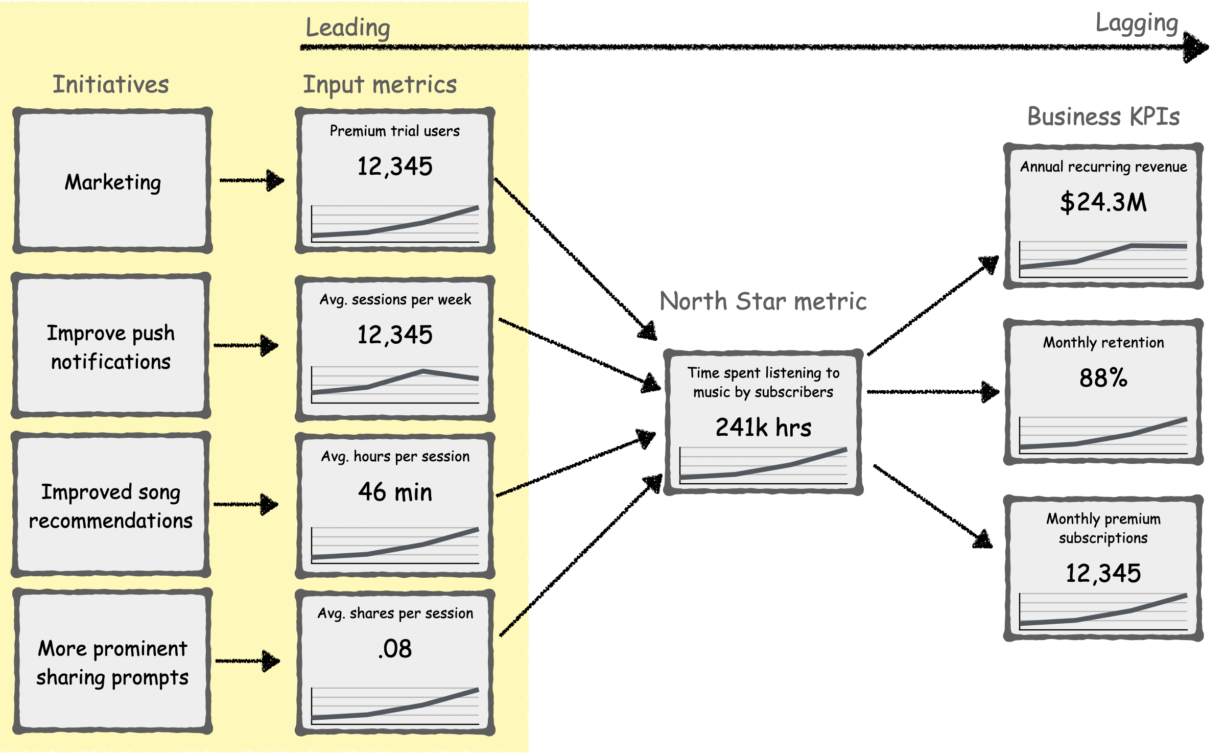
This dashboard goes beyond business performance to show the initiatives that we’re doing to improve performance.
For example, we're doing marketing to get more trial users, sending better push notifications to increase frequency, improving our recommendation algorithm to lengthen sessions, and prompting users to share more.
If everyone in the company had access to a dashboard like this, they'd know how their work fits into the big picture of the business. At DoubleLoop, we've seen that providing this level of strategic clarity measurably improved employee satisfaction for one of our customers.
Powerfully, organizing our metrics as a graph allows us to evaluate the assumptions behind our strategy…
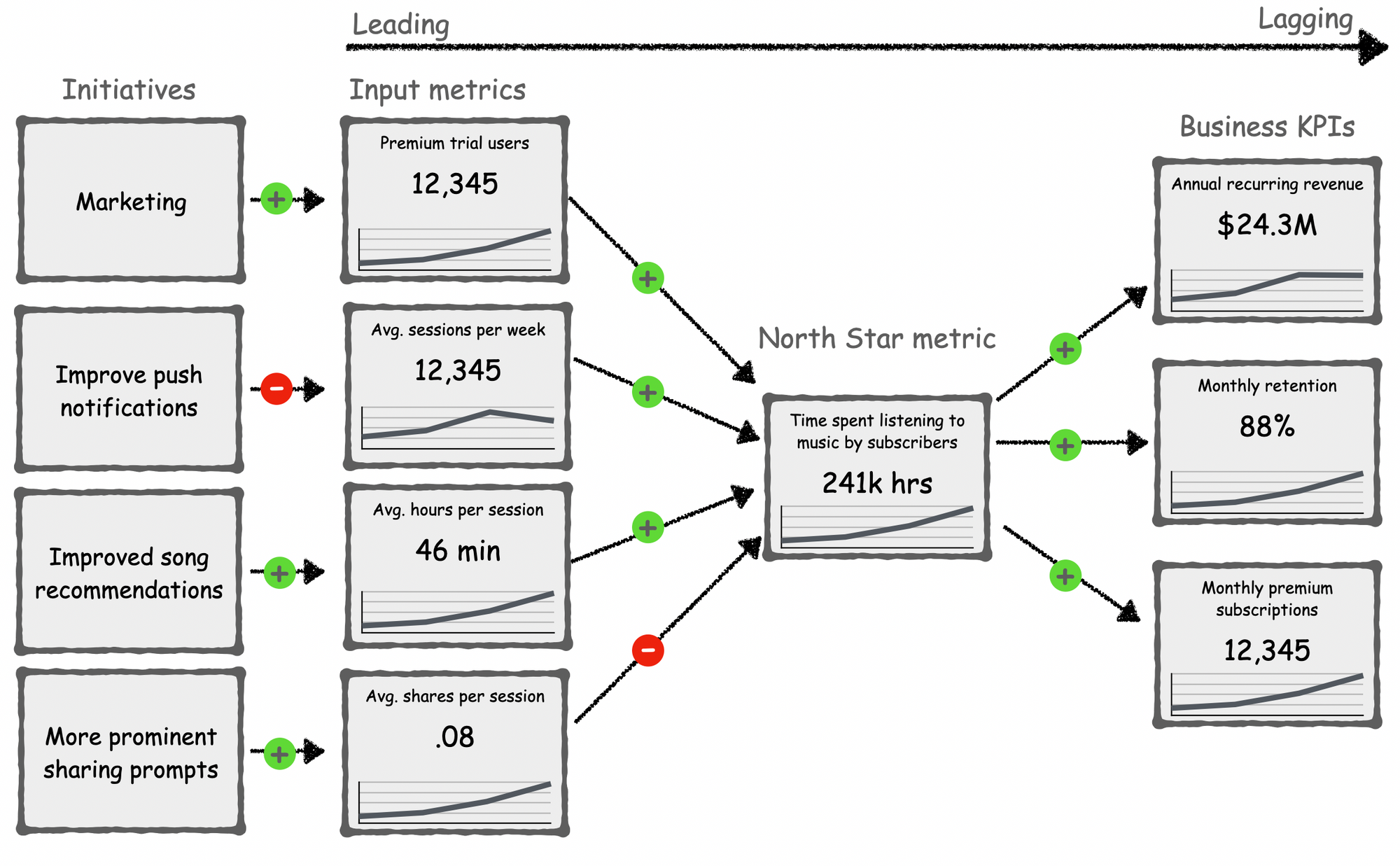
Our assumptions, of course, are just theories.
We *think* that growing our north star metric will grow our business KPIs, that growing our input metrics will influence our north star metric, and that our projects will improve performance of our input metrics.
Our strategic assumptions could be wrong. Having our dashboard laid out like a graph allows us to examine the relationship between metrics and the efficacy of how our initiatives are moving metrics, or not.
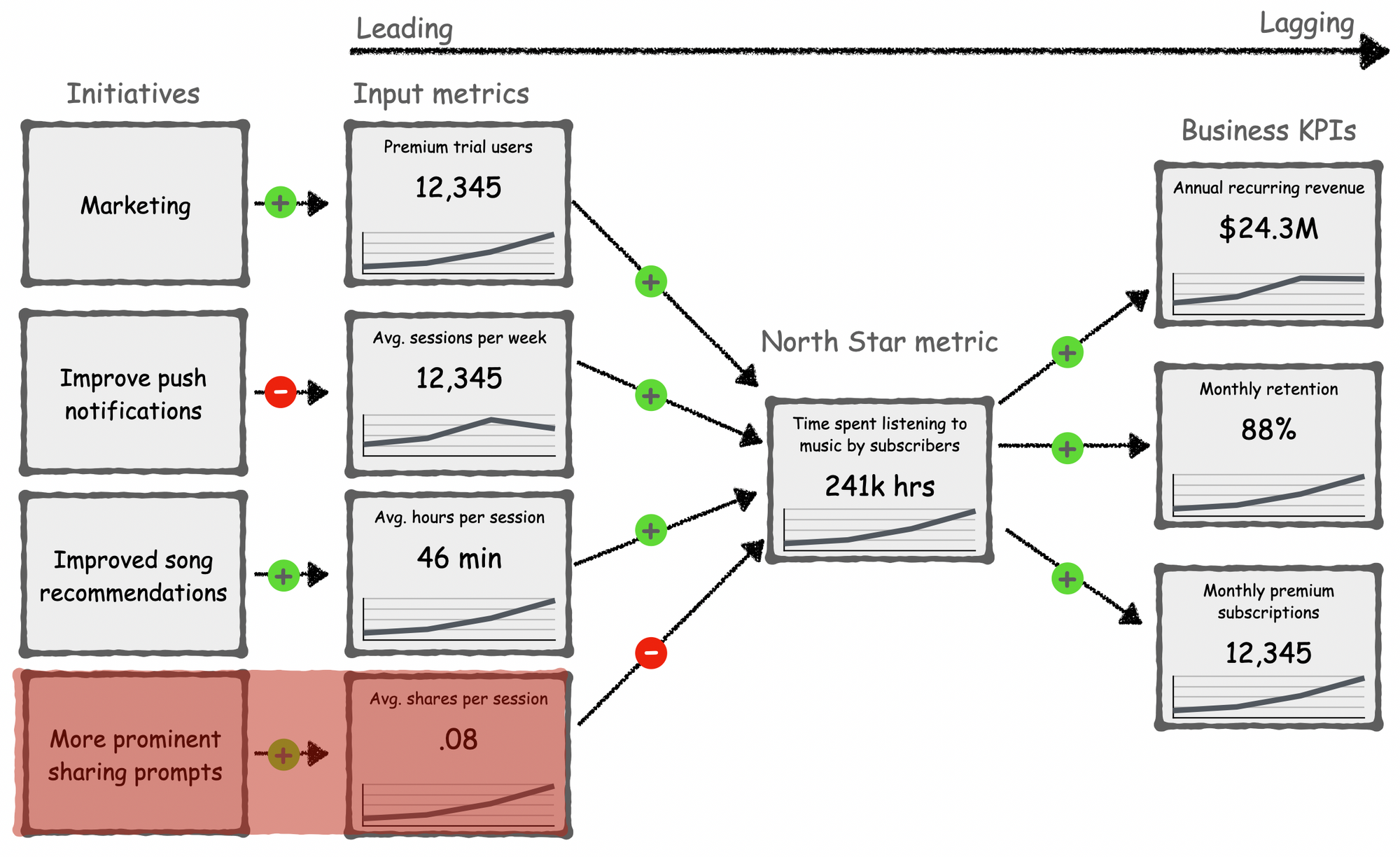
For example, we might conclude that increasing shares per session does not influence our north star metric.
Based on this insight, we can stop our effort to improve that metric and narrow our focus to metrics that are more predictive of business success. Our company strategy should orient work around the highest-leverage lead measures.
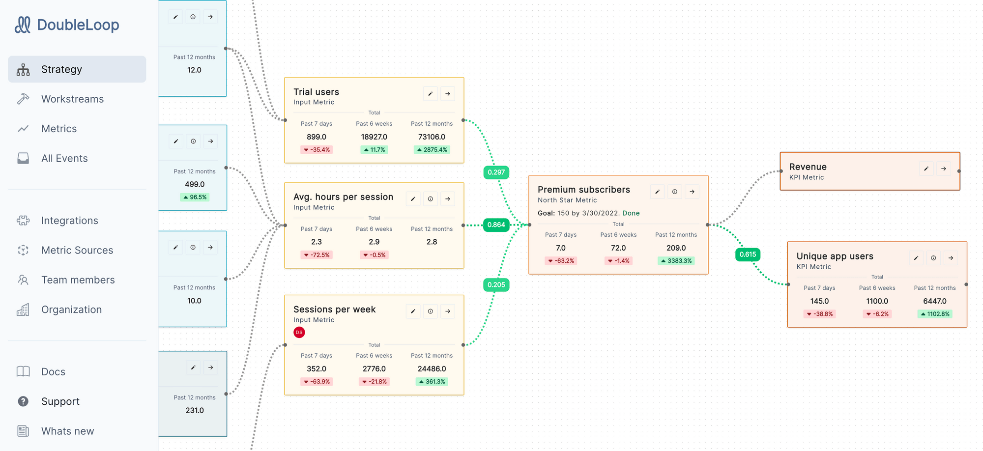
To help with this form of analysis, at DoubleLoop we're developing correlation scores between metrics so you can find flawed assumptions in your strategy. For example, one of our customers found that dozens of their people were focused on an input metric that was inversely correlated with their North Star. The $2M per year that the company was spending on the initiative, they discovered, was actually hurting the business. With this insight in hand, they adjusted the metric to a measure that was predictive of their North Star. If they hadn't mapped their strategy with live data in DoubleLoop, they would have continued to pour money down the drain.
Sometimes the problem is not the metric. Instead, the problem can be how we're trying to move that metric. For example, we might conclude that our effort to improve push notifications is not increasing sessions per week.
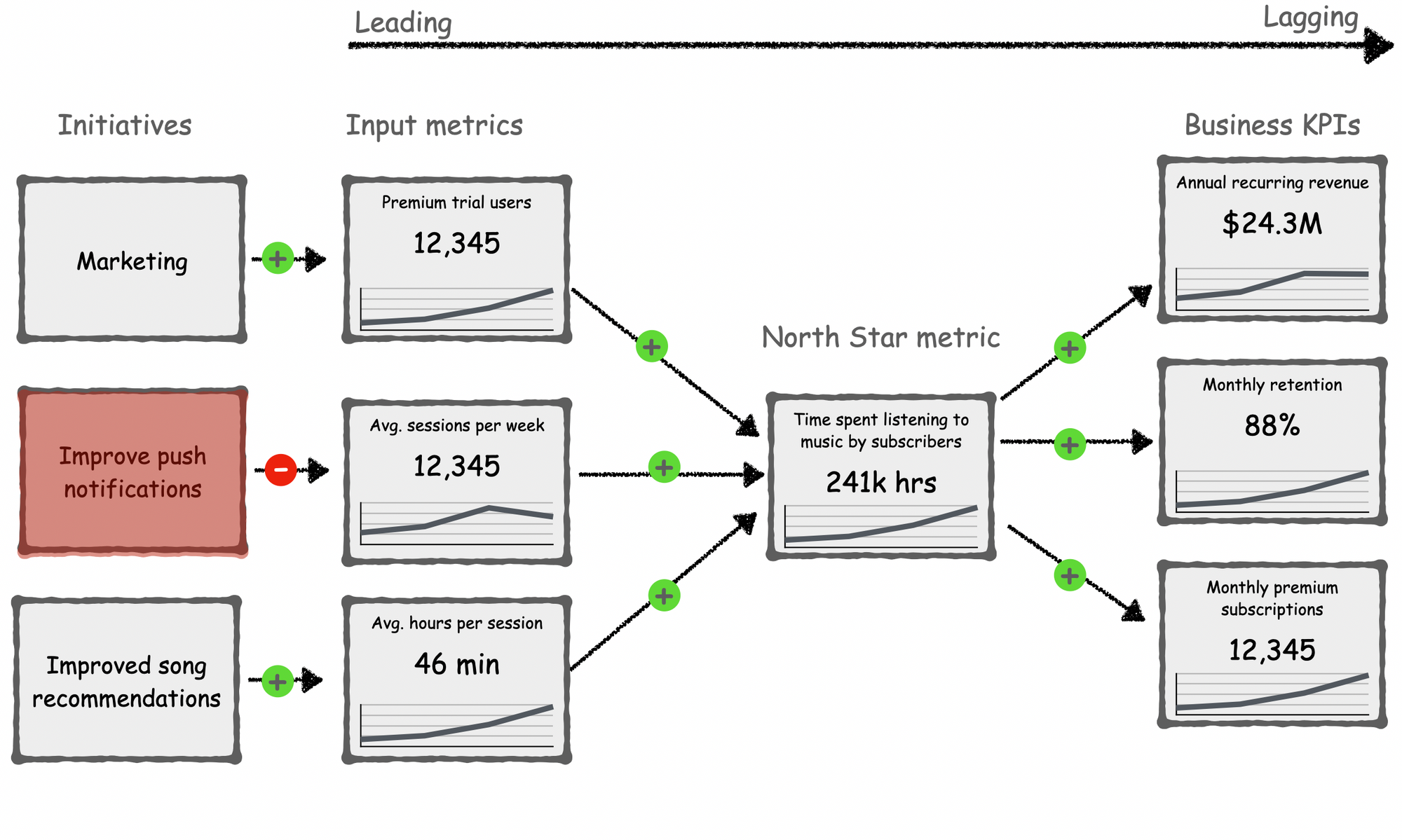
With this information, we can stop that initiative, and pivot to a different tactic. Expanding the size of our song catalog, for example, could be a more effective tactic to increase frequency.
The only thing harder than achieving strategic alignment at your company is sustaining alignment.
Most strategies are fragile. Alignment breaks as soon as new information undercuts an assumption in the strategy.
A strategy operationalized in DoubleLoop, in contrast, is antifragile. With new information, the strategy and team alignment get stronger. Increased data volume leads to richer strategic insights.
If you’d like us to help transform your flat metrics dashboard into a living and breathing, actionable strategy, signup at DoubleLoop.app.
Here's a teaser screenshot:
Looking for more?
Watch the video version of this post:
Further reading:
- The North Star Playbook (John Cutler, Jason Scherschligt)
- Working Backwards: Insights, Stories, and Secrets from Inside Amazon (Colin Bryar, Bill Carr)
- The 4 Disciplines of Execution (Chris McChesney, Sean Covey, Jim Huling)
- Don't Let Your North Star Metric Deceive You (Brian Balfour, Shaun Clowes, & Casey Winters)
- Some Notes on Executive Dashboards (Tom Critchlow)